Live · Personal Project
CartoChrome
Walk Score for Healthcare, a 0–100 access score for every ZIP Code in America, powered by 21 government data sources and peer-reviewed spatial analysis.
0
Programmatic Pages
0
ZIP Codes
0
Providers
0
Gov Data Sources
The Problem
How good is healthcare where you live?
Walk Score rates neighborhoods for walkability. Zillow rates them for housing. But there was no equivalent for healthcare access, no single number that accounts for how many doctors are nearby, how far the nearest hospital is, whether specialists are accessible, and how those factors compare to the rest of the country. So I built one.
The Product
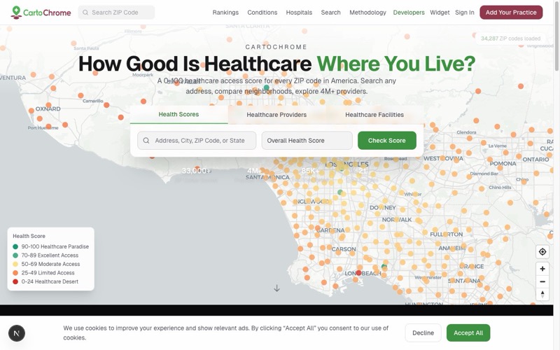
Interactive map, healthcare access scores with provider density overlay
Click a city to see its score
The Score
Four dimensions, one number
Every ZIP Code is scored across four dimensions of healthcare accessibility, weighted and combined into a single 0–100 number.
Design Principle
“There’s a doctor nearby” ≠ “You can actually see a doctor.”Most measures only count providers. CartoChrome goes further, measuring supply, competition for appointments, social barriers like insurance and income, and transportation infrastructure. Good social factors can’t inflate a score. They can only prevent a penalty.
35%
Provider Score
How many doctors, specialists, dentists, and mental health providers are near you, weighted by how many patients compete for their time.
Primary Care ~45%Specialists ~25%Mental Health ~18%Dental ~12%
25%
Hospital Score
How close and how good nearby hospitals, ERs, and screening centers are, weighted by bed count and quality ratings.
Emergency ~40%Inpatient ~35%Screening ~25%
20%
People Score
Social barriers that reduce effective access, even if there’s a hospital next door, can people here actually use it?
InsuranceIncomeHealth LiteracyDisabilityAge
20%
Travel Score
Transportation infrastructure to reach care, vehicle ownership, public transit availability, broadband for telehealth.
Vehicle Access 35%Transit 25%Broadband 25%Urbanicity 15%
Try It
Look up any ZIP Code
--
Provider Score35%
Hospital Score25%
People Score20%
Travel Score20%
Score Composition
ProviderHospitalPeopleTravel
The Algorithm
Enhanced Two-Step Floating Catchment Area (E2SFCA)
A peer-reviewed spatial analysis method (Luo & Qi, 2009), adapted with SDOH barriers and log-softcap normalization.
Step 01
Define Catchment Areas
Draw a service area around every ZIP Code and count the providers inside it. Circles vary by urban/rural status, different radii and decay curves for each healthcare type.
Step 02
Factor Competition
Divide each provider’s capacity by the total population competing for their time. A doctor serving 800 people is more accessible than one serving 8,000.
0 providers
0 population
Step 03
Weight & Combine
Multiply each dimension by its weight and sum them into a Base Access Score. Provider access carries the most weight because it most directly determines whether you can see a doctor.
Step 04
SDOH Penalty
People Score and Travel Score capture real-world barriers. They can reduce a score by up to 65% in disadvantaged areas. Good social factors can’t inflate a score, they can only prevent a penalty.
Base: 85After SDOH: 72
Up to 65% reduction in areas with severe barriers
Step 05
Log-Softcap Normalization
Scale to 0–100 using log-softcap normalization. This maintains national ranking while preventing scores from bunching at 100 in provider-dense areas.
The Pipeline
21 sources → 1 score
Provider Score
3
CMS NPPES (4M+ profiles) Weekly
CMS Care Compare Quarterly
SAMHSA Locator Quarterly
Hospital Score
3
CMS Hospital Compare Monthly
CMS Provider of Services Quarterly
FDA MQSA Quarterly
People Score
3
Census ACS 5-Year Annually
CDC PLACES Annually
HRSA HPSA Quarterly
Travel Score
3
Census TIGER/Line Annually
USDA RUCA Codes On change
FCC Broadband Annually
Validation & Calibration
9
County Health Rankings + 8 additional sources
PostGIS + E2SFCA
Spatial joins · SDOH penalties · Log-softcap normalization
0–100
Access Score
5.1M
Generated Pages
API
RESTful Endpoints
Validation
Tested against real-world data
CartoChrome scores are validated against federal health data and academic benchmarks to make sure the numbers mean something.
r > 0.65
Correlation with CDC PLACES health utilization measures
Source: CDC
r > 0.70
Correlation with County Health Rankings data
Source: UW Population Health Institute
>70%
Concordance with HRSA-designated Health Professional Shortage Areas
Source: HRSA
Academic Foundation
Core methodology: Luo & Qi (2009) Enhanced Two-Step Floating Catchment Area method, cited 2,000+ times in public health research. Supporting research on SDOH barriers (Syed et al., 2013) and rural healthcare adaptations (McGrail, 2012).
36 academic papers referenced
Tech Stack
Frontend
Backend
Data Pipeline
Spatial
Infrastructure
Maps
Challenges
What I learned
The hardest part wasn’t the algorithm, it was cleaning 21 data sources with different schemas, coordinate systems, and update frequencies into a single consistent pipeline. CMS provider data alone has 47 different file formats. Getting all of that to reconcile at the ZIP-code level, with correct geocoding and deduplication across sources, was the real engineering challenge. Then building the SDOH penalty system on top of it, making sure social barriers reduce scores without creating false deserts in wealthy areas with low utilization.